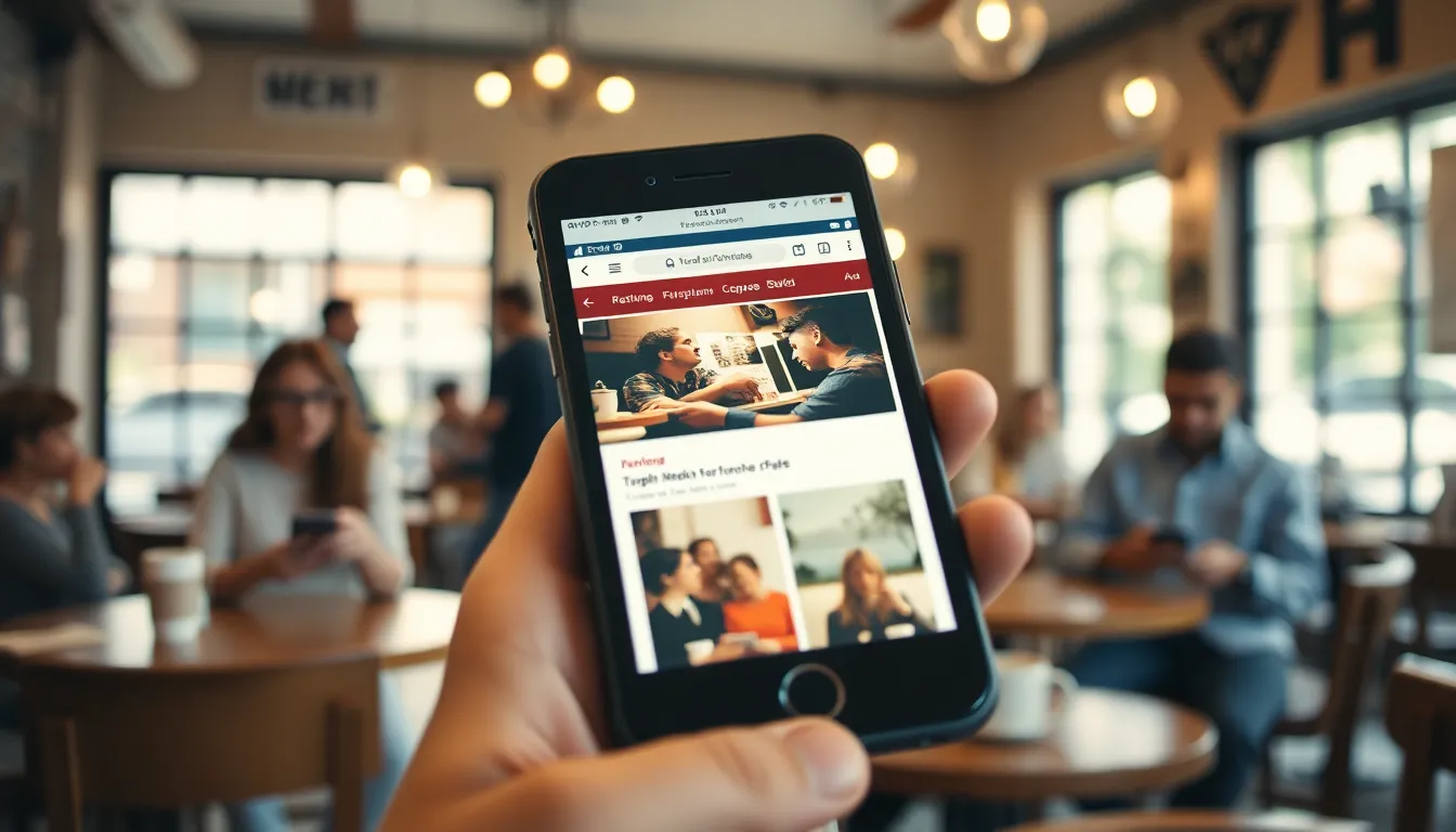
In a world where smartphones have become an extension of our very selves, mobile first design isn’t just a trend—it’s a necessity. Imagine trying to fit a square peg into a round hole; that’s what it feels like when a website isn’t optimized for mobile. With more people browsing on their phones than ever before, neglecting mobile design is like ignoring a fire alarm while your house is burning down.
Mobile first design prioritizes the small screen, ensuring users have a seamless experience no matter where they are. It’s all about crafting a digital space that’s not only functional but also delightful. So, if you want to keep your audience engaged and coming back for more, it’s time to embrace the mobile revolution. After all, in the battle for attention, the tiny screen is the heavyweight champion.
Understanding Mobile First Design
Mobile first design focuses on creating websites optimized for smartphones before expanding to larger screens. This approach prioritizes user experience, ensuring that mobile users receive an efficient and engaging interface.
Definition and Importance
Mobile first design means building websites primarily for mobile devices. This strategy reflects the growing trend of users accessing content on smartphones, with over 50% of total web traffic originating from mobile sources. Emphasizing mobile optimization helps improve site performance, as it often leads to faster load times and better navigation on smaller screens. Ignoring mobile design risks alienating a significant portion of the audience. Prioritizing mobile enhances user engagement, retention, and overall satisfaction.
Key Principles
Essential principles guide effective mobile first design. First, simplicity matters; intuitive navigation minimizes clutter and enhances usability. Second, responsive design ensures that sites adapt seamlessly to various screen sizes. Third, prioritizing fast loading times improves user retention, as delays can lead to higher bounce rates. Fourth, touch-friendly elements increase accessibility, allowing easy interaction with buttons and links. Finally, focusing on essential content keeps users engaged while minimizing distractions. Following these principles leads to a better mobile experience that satisfies user needs.
Benefits of Mobile First Design
Mobile first design offers significant advantages in today’s digital landscape. Prioritizing the mobile user experience leads to enhanced engagement and satisfaction.
Enhanced User Experience
Enhanced user experience stems from the focus on mobile optimization. Simplified navigation makes it easy for users to find what they need quickly. Responsive considerations ensure elements resize properly on various devices. Fast loading times prevent frustration, keeping users on the site longer. Touch-friendly features improve interaction for users on smartphones. Engaging essential content retains user interest and encourages exploration.
Improved SEO Performance
Improved SEO performance results from adopting mobile first design principles. Search engines prioritize mobile-friendly sites in rankings. Over half of all web traffic comes from mobile devices, making mobile optimization crucial. Ensuring compatibility with Google’s algorithm enhances visibility. High engagement metrics indicate user satisfaction, further boosting rankings. Prioritizing mobile leads to better indexing and higher organic traffic rates.
Best Practices for Implementing Mobile First Design
Implementing mobile first design involves several best practices that enhance user experience. Prioritizing a seamless interaction with mobile users drives engagement.
Responsive Layouts
Responsive layouts adjust seamlessly to various screen sizes and orientations. Flexibility in design ensures that content displays effectively on smartphones, tablets, and desktops. Designers should use fluid grids and media queries to create a layout that adapts to different devices. Implementing a mobile grid system simplifies the design process. This approach enhances readability and accessibility, keeping mobile users engaged and satisfied.
Touch-Friendly Elements
Touch-friendly elements are crucial for an enjoyable mobile experience. Users interact primarily through touch, making button size and spacing essential. Ensure buttons are at least 44 pixels wide for optimal usability on small screens. Implementing clear icons and ample spacing prevents accidental clicks. Additionally, prioritize gestures like swiping to enhance navigation efficiency. By focusing on touch-friendly designs, developers improve accessibility, leading to higher user retention rates.
Common Challenges and Solutions
Mobile first design presents specific challenges, particularly concerning screen sizes and balancing features with performance. Addressing these challenges effectively ensures an optimal user experience.
Navigating Screen Size Constraints
Designers face limitations when scaling content for smaller screens. Content must adapt fluidly, without sacrificing usability. Implementing media queries enables screens to resize appropriately based on device dimensions. Ensuring key elements are easily accessible on smaller screens enhances user engagement. Prioritization of content is essential to keep loading times low while still highlighting vital information. By emphasizing essential features, designers can create an efficient layout that enhances mobile interactions.
Balancing Features and Performance
Integrating numerous features while optimizing performance remains a common challenge. Users expect rich functionality, yet slow loading times can lead to increased bounce rates. Prioritizing speed over extensive features helps maintain user satisfaction. Compressing images and minimizing code can improve load times without sacrificing quality. Efficient loading improves overall performance and supports higher engagement levels. Striking a balance between usability and aesthetic appeal is crucial for retaining visitor interest and promoting a seamless mobile experience.
Mobile first design is no longer optional; it’s a necessity for anyone looking to succeed in the digital landscape. By prioritizing mobile optimization, businesses can significantly enhance user experience and engagement. This approach not only caters to the growing number of mobile users but also improves site performance and SEO rankings.
Embracing best practices in mobile design ensures that websites are not just functional but also enjoyable to navigate. As the digital world continues to evolve, adapting to mobile first principles will keep brands ahead of the competition and foster lasting connections with their audience. Ultimately, investing in mobile first design is a strategic move that pays off in user satisfaction and loyalty.